Good Design. Bad Design
Estimated Reading Time: 5-7 minutes
Shu Shu and I were having lunch together and discussing the idea that design is something that—regardless of whether it is good or bad—you know when you see it.
Let’s test that idea to see if it’s true.
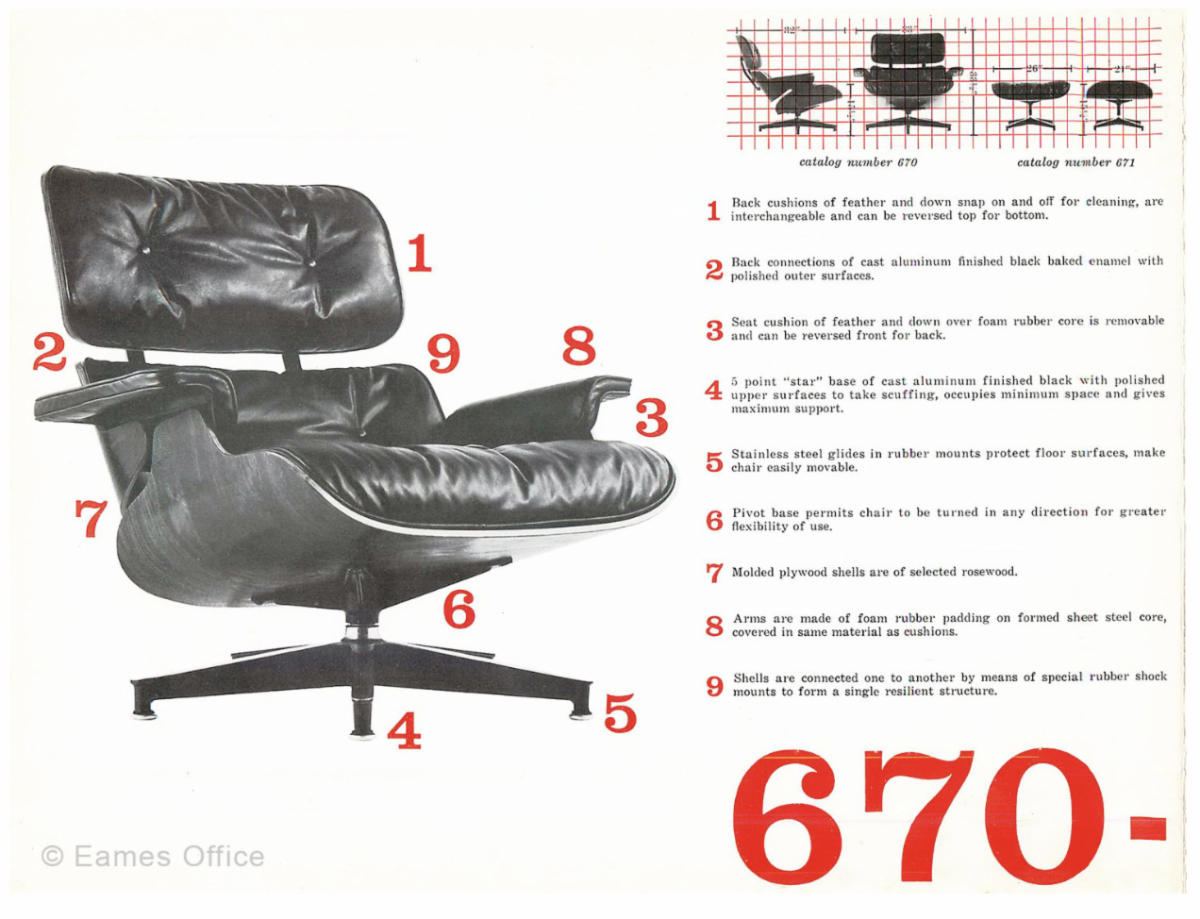
Take the iconic Eames Chair. Just looking at it, you know what it is. If you have ever had the privilege of sitting in one, or even owning one, you know that it is as comfortable as it is beautiful. And you recognize it immediately because it has been endlessly copied. Good design.
Airport design. Have you ever found yourself in an airport, baffled or confused about where to go, how to get there, and how long it will actually take you to get there? Bad lighting, bad seating, bad air flow. We travel a lot at L+D, and we have seen just about every major, and most minor airports in the United States. Even some internationally, and each partner at L+D can tell you immediately which airports rank at the bottom for airport design. JFK and LAX are tied for number one in my ranking of bad airport design.
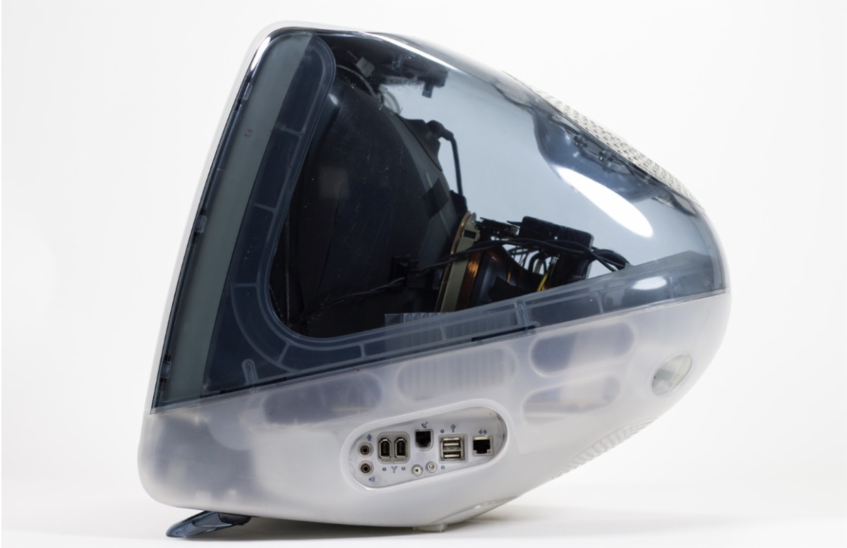
Remember when Apple just cranked out one device after the other that inspired and took your breath away? That was peak Apple design with Jony Ive at the helm of Apple’s design studio. Apple’s design team was focused on creating products that just looked amazing, were easy and intuitive to use, and felt like we might have finally arrived in the time of The Jetsons? Peak Apple included designs like the iMac G3. I still own an operating iMac G3 DV Special Edition. I also have the first iPod, introduced in 1998. It was the Walkman of the future. Does your iPhone have a case or do you carry it naked? Great design.
Consider Microsoft’s response: the Zune. Key factors included bad timing and insufficient innovation, a poorly defined ecosystem compared to Apple’s established one, weak marketing and branding, and the looming impact of smartphones, which rendered standalone music players obsolete. In early 2007, the company lost $289 million in one quarter. Bad design.
We know good design when we see it. We know it because we can feel it. We know it because of how it enhances the human experience. Likewise, when we encounter bad design, it is just as obvious. Think of the designfailures that have become infamous: the Ford Edsel, New Coke, Google Glass. In many ways, these were prototypes on a grand scale, and they served that purpose. Designers understand that the art of design is in tapping into, and anticipating the zeitgeist of the moment.
Which is why design is more important than ever. What is our response to the human experience of this moment? We are all feeling it. Everyone is having a reaction to it. One hundred years into the future, what will history say about how we responded to it, and what role did design play in shaping it? Design is also subtle, and it forces you to choose what is important and what human problem, need, or challenge you are trying to solve. Think about these simple examples that focus on a particular design element.
Emphasis is about focus. Instagram’s red notification dot is a great example.
The New York Times front page on printed copies of the paper beautifully demonstrates the concept of balance and stability.
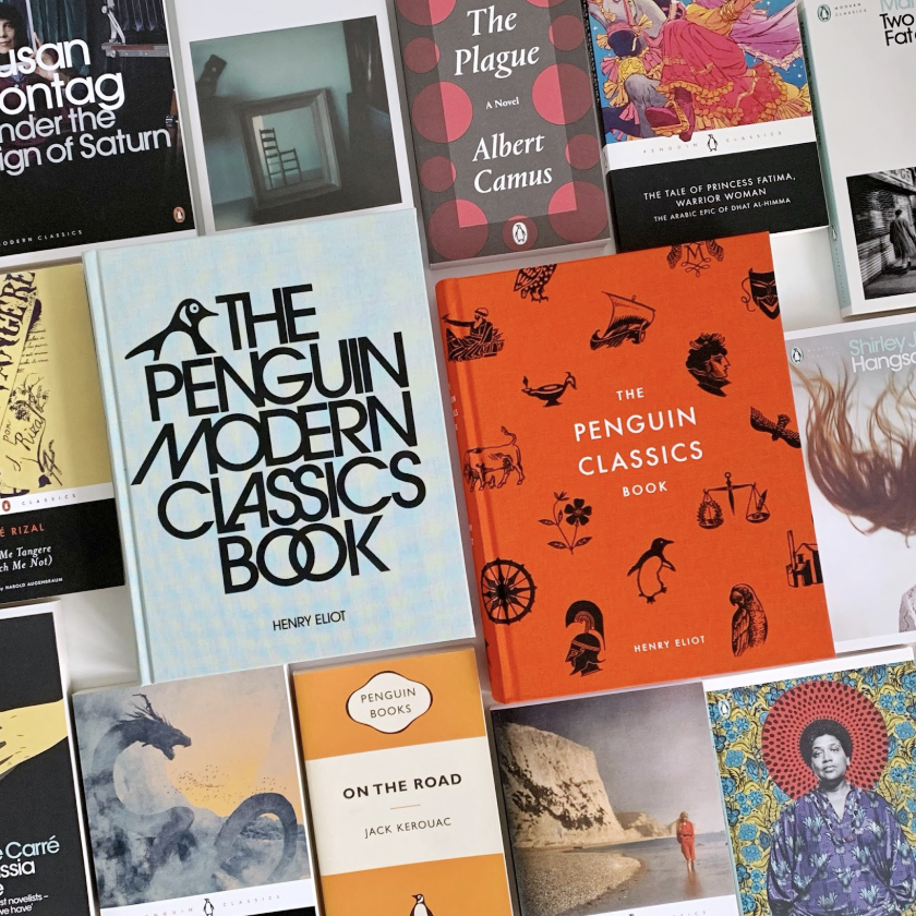
Penguin Classics’ use of contrast is iconic. It focuses on clarity. You know a Penguin Classic book when you see the cover. The use of contrast is bold and intentional, and they dared us to judge a book by its cover.
“Just Do It.” Repetition. Do you remember Nike before they had “Just Do It” as their tagline? Here’s a hint: the number one record on Billboard’s Hot 100 was “Faith” by George Michael. (A copy I own from 1998 in my personal record collection.) Nike has consistently used this same tagline for over 36 years.
White space. www.google.com. Since it first launched, Google’s main page has always been an excellent example of white space. No clutter, no noise, just the basics.
When you think of Dyson products, what do you think of? I always think about flow. Their vacuums, hair dryers, filters, their fans, their entire industrial design aesthetic places a heavy emphasis on the concept of flow. How things fit together and work together harmoniously.

These are just a few of the design principles that every designer employs in both good and bad design experiments. As designers, we use these principles in helping organizations make important and strategic design decisions. These could be about how you use time. They are applied to new programs or services. However, the challenge I see most often is organizations making design decisions without considering why or how those choices will impact the human experience.
Here is a chance to play anthropologist by participating in an observation challenge for you, dear reader. Over the course of next week, make note, either by writing things down or taking a photo, of examples throughout your organization that are clear examples of good and bad design choices.
These examples can be space or facilities related. They can be schedule-related or time-related. You can look closely at some program design choices you have made and ask yourself if you would say they were good or bad design choices. Then sit down with that list and spend some time reflecting on why those design choices were made and whether they are solving the human need, challenge, or opportunity you hoped they would.
You have heard us say that educators are experience designers. So this is a great year to think about that idea.
We craft and design learning experiences with the hope of inspiring future generations to live with purpose, meaning, and harmony. This year is an invitation to explore and challenge some of your existing design choices. You know you want to. Because, let’s face it, when you experience good design during your workday, you know it and you see it. And when you experience bad design, it is just as clear.